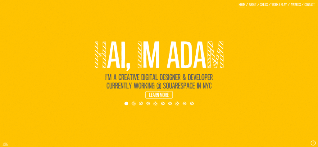
For a little over a month now I have been involved in a project to design my own online portfolio space and surrounding website.

Now although I have done plenty of web design before I had never considered what my own personal website would look like. I knew I needed one but well, I hadn’t given much thought to what I would actually do about it. So, when an assignment brief asking me to do just that was put on my table I didn’t know where to start, so I began researching.
It took me a while, but I eventually started to see trends in portfolio websites and concepts I enjoyed and that inspired my own work. Other creatives like Josh McCartney, Adam Hartwig, Albino Tonnina and Samuel Reed blew me away with their own personal portfolios and really moved me into action.
((Check out their work, they’re really good))
I still took my time though, plenty of deliberating and sketching, considering all of my options and how best to lay out the site. What should I include? How should it be prioritised? How should it look? Questions whirring though my mind about how to best complete everything.
Eventually I settled into a style, one that I thought well represented me through the website, and I got to work prototyping. Playing with fonts, colours, sizing- tweaking what wasn’t working as I was going. Soon the end goal was in sight and the deadline approaching. I would soon have to submit my proposal to the tutors and receive my feedback. There were long nights and lots of frustrated muttering at that one thing you just can’t get to look right, but in the end, I pulled everything together to present a proposal I am happy with.